


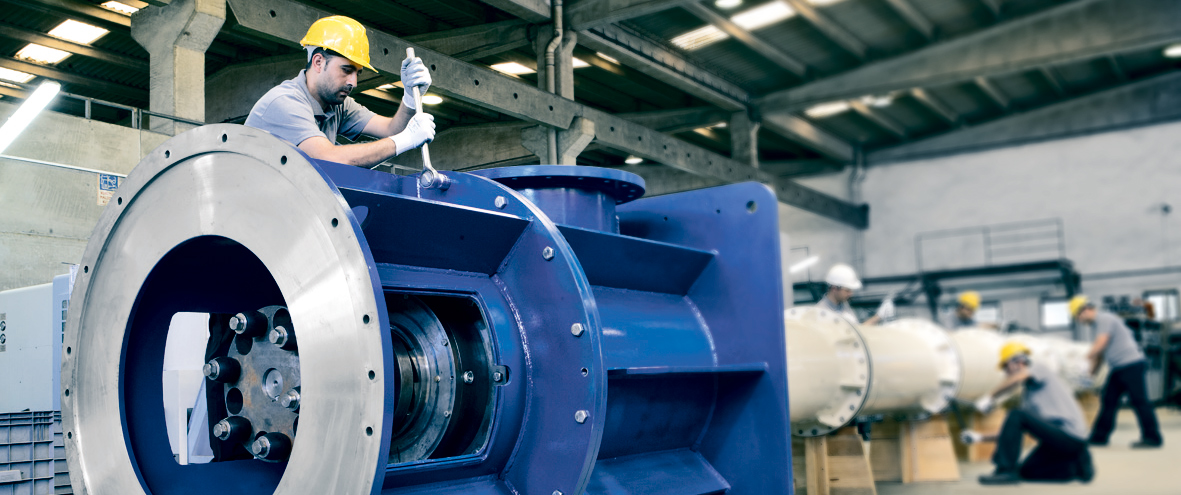


Türbin Pompaları
Türbin pompaları üretiminde uzmanlaşmış Vansan 600 m.’ye kadar su basabilen 10 m³/h – 30.000 m³/h kapasite aralığındaki Dik Milli Türbin Pompası projelerinizin güçlü çözüm ortağı…

Jeotermal Pompalar
Türkiye ve Avrupa’nın lider “Jeotermal Pompa” üreticisi Vansan 200 ºC’ye kadar olan sıcaklıklar için kullanılan Jeotermal Pompa üretimlerini 1984’den beri başarıyla sürdürmektedir.

 https://vansan.com.tr/wp-content/uploads/2021/04/ebara-vansan-haber-tr.jpg
600
1600
yonetici
/wp-content/uploads/2014/03/logo3.png
yonetici2021-04-28 17:30:282021-04-28 17:30:28Ebara Corporation, Vansan'ın Hisselerini Satın Aldı...
https://vansan.com.tr/wp-content/uploads/2021/04/ebara-vansan-haber-tr.jpg
600
1600
yonetici
/wp-content/uploads/2014/03/logo3.png
yonetici2021-04-28 17:30:282021-04-28 17:30:28Ebara Corporation, Vansan'ın Hisselerini Satın Aldı...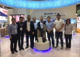 https://vansan.com.tr/wp-content/uploads/2018/06/WhatsApp-Image-2018-06-02-at-14.58.31.jpeg
1200
1600
yonetim
/wp-content/uploads/2014/03/logo3.png
yonetim2018-06-05 11:14:472018-06-08 10:51:45Flowtech China 2018 Fuarındaydık
https://vansan.com.tr/wp-content/uploads/2018/06/WhatsApp-Image-2018-06-02-at-14.58.31.jpeg
1200
1600
yonetim
/wp-content/uploads/2014/03/logo3.png
yonetim2018-06-05 11:14:472018-06-08 10:51:45Flowtech China 2018 Fuarındaydık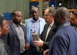 https://vansan.com.tr/wp-content/uploads/2018/01/vansan-salar-pump-uganda-ziyaret.jpg
600
1698
admin
/wp-content/uploads/2014/03/logo3.png
admin2017-11-05 15:05:472021-03-01 13:30:13Uganda Su ve Çevre Bakanından Vansan Ziyareti
https://vansan.com.tr/wp-content/uploads/2018/01/vansan-salar-pump-uganda-ziyaret.jpg
600
1698
admin
/wp-content/uploads/2014/03/logo3.png
admin2017-11-05 15:05:472021-03-01 13:30:13Uganda Su ve Çevre Bakanından Vansan Ziyareti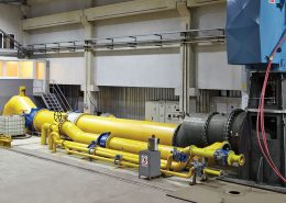 https://vansan.com.tr/wp-content/uploads/2017/12/haber-vansan-pompa-deney-standi.jpg
557
1030
cem akyol
/wp-content/uploads/2014/03/logo3.png
cem akyol2017-08-25 10:38:212018-03-23 17:17:58Pompa Deney Laboratuvarı'na TURKAK’tan Tescil
https://vansan.com.tr/wp-content/uploads/2017/12/haber-vansan-pompa-deney-standi.jpg
557
1030
cem akyol
/wp-content/uploads/2014/03/logo3.png
cem akyol2017-08-25 10:38:212018-03-23 17:17:58Pompa Deney Laboratuvarı'na TURKAK’tan Tescil https://vansan.com.tr/wp-content/uploads/2017/02/haber-ilk500.jpg
567
1030
cem akyol
/wp-content/uploads/2014/03/logo3.png
cem akyol2017-02-24 11:24:122018-03-23 18:44:21Vansan İhracat Sıralamasında İlk 500’de.
https://vansan.com.tr/wp-content/uploads/2017/02/haber-ilk500.jpg
567
1030
cem akyol
/wp-content/uploads/2014/03/logo3.png
cem akyol2017-02-24 11:24:122018-03-23 18:44:21Vansan İhracat Sıralamasında İlk 500’de.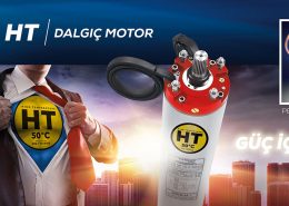 https://vansan.com.tr/wp-content/uploads/2017/12/haber-HT-Vansan-ht-motor-pe2-pa-bobin-telli-header.jpg
486
1030
cem akyol
/wp-content/uploads/2014/03/logo3.png
cem akyol2017-01-12 11:52:302018-02-28 02:22:52Dalgıç Motorlarımız PE2-PA ile Şimdi Daha Güçlü
https://vansan.com.tr/wp-content/uploads/2017/12/haber-HT-Vansan-ht-motor-pe2-pa-bobin-telli-header.jpg
486
1030
cem akyol
/wp-content/uploads/2014/03/logo3.png
cem akyol2017-01-12 11:52:302018-02-28 02:22:52Dalgıç Motorlarımız PE2-PA ile Şimdi Daha Güçlü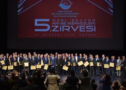 https://vansan.com.tr/wp-content/uploads/2017/12/haber-arge-merkezi-0-header.jpg
686
1030
cem akyol
/wp-content/uploads/2014/03/logo3.png
cem akyol2016-09-27 12:05:432018-03-23 17:19:43Pompa İmalatçıları İçinde İlk Ar-Ge Merkezi Vansan Oldu!
https://vansan.com.tr/wp-content/uploads/2017/12/haber-arge-merkezi-0-header.jpg
686
1030
cem akyol
/wp-content/uploads/2014/03/logo3.png
cem akyol2016-09-27 12:05:432018-03-23 17:19:43Pompa İmalatçıları İçinde İlk Ar-Ge Merkezi Vansan Oldu!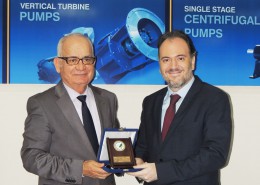 https://vansan.com.tr/wp-content/uploads/2014/05/DSCN3541.jpg
760
1024
admin
/wp-content/uploads/2014/03/logo3.png
admin2014-03-22 09:49:232018-03-23 17:22:04Ege Orman Vakfı'na Vansan’dan Yaşam Suyu
https://vansan.com.tr/wp-content/uploads/2014/05/DSCN3541.jpg
760
1024
admin
/wp-content/uploads/2014/03/logo3.png
admin2014-03-22 09:49:232018-03-23 17:22:04Ege Orman Vakfı'na Vansan’dan Yaşam Suyu